STELLA: L'ART DU CAFE
STELLA: L'ART DU CAFE
Stella Café needed more than a logo-they needed an identity that celebrated their craft. Through careful design and strategic art direction, I created a complete visual language: from packaging that speaks to quality, to social media that builds community, to event materials that create moments. Seven months of collaboration transformed their brand vision into reality.
Stella Café needed more than a logo-they needed an identity that celebrated their craft. Through careful design and strategic art direction, I created a complete visual language: from packaging that speaks to quality, to social media that builds community, to event materials that create moments. Seven months of collaboration transformed their brand vision into reality.
CLIENT
STELLA COFFEE
DELIVERABLES
Logo Design Packaging Design Brand Guidelines Social Media Content Event Materials
Year
2025
Role
Graphic Designer
Translating a static brand identity into a dynamic broadcast UI requires strict adherence to Information Architecture (IA) and visual hierarchy.
I engineered a motion design system utilizing the official FIFA WC 26 brand guidelines. By carefully mapping the color palette and typography (ranging from Thin to ExtraBold), I ensured optimal legibility, accessibility, and minimal cognitive load across various screen sizes. Every vector wipe and typographic reveal was calculated to guide the viewer’s eye seamlessly through the broadcast information.
Before moving into high-fidelity digital production, I developed low-fidelity wireframes and storyboards. This phase was crucial for testing the visual flow, screen framing, and the pacing of the narrative arc. By treating the sequence as a user journey, the storyboard animatic allowed us to map out camera cuts and transitions against the audio track, ensuring that the digital experience felt intuitive, rhythmic, and highly engaging before executing the final motion keyframing.
Before moving into high-fidelity digital production, I developed low-fidelity wireframes and storyboards. This phase was crucial for testing the visual flow, screen framing, and the pacing of the narrative arc. By treating the sequence as a user journey, the storyboard animatic allowed us to map out camera cuts and transitions against the audio track, ensuring that the digital experience felt intuitive, rhythmic, and highly engaging before executing the final motion keyframing.

2024:
Digital Disruptions
(Mixed Media) 2024:
Building a Digital Coffee Culture:
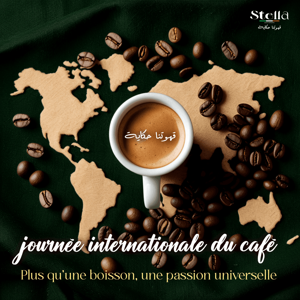
For Stella Café, the objective was to craft a visual identity that transcended a standard logo to create a deeply resonant brand experience.
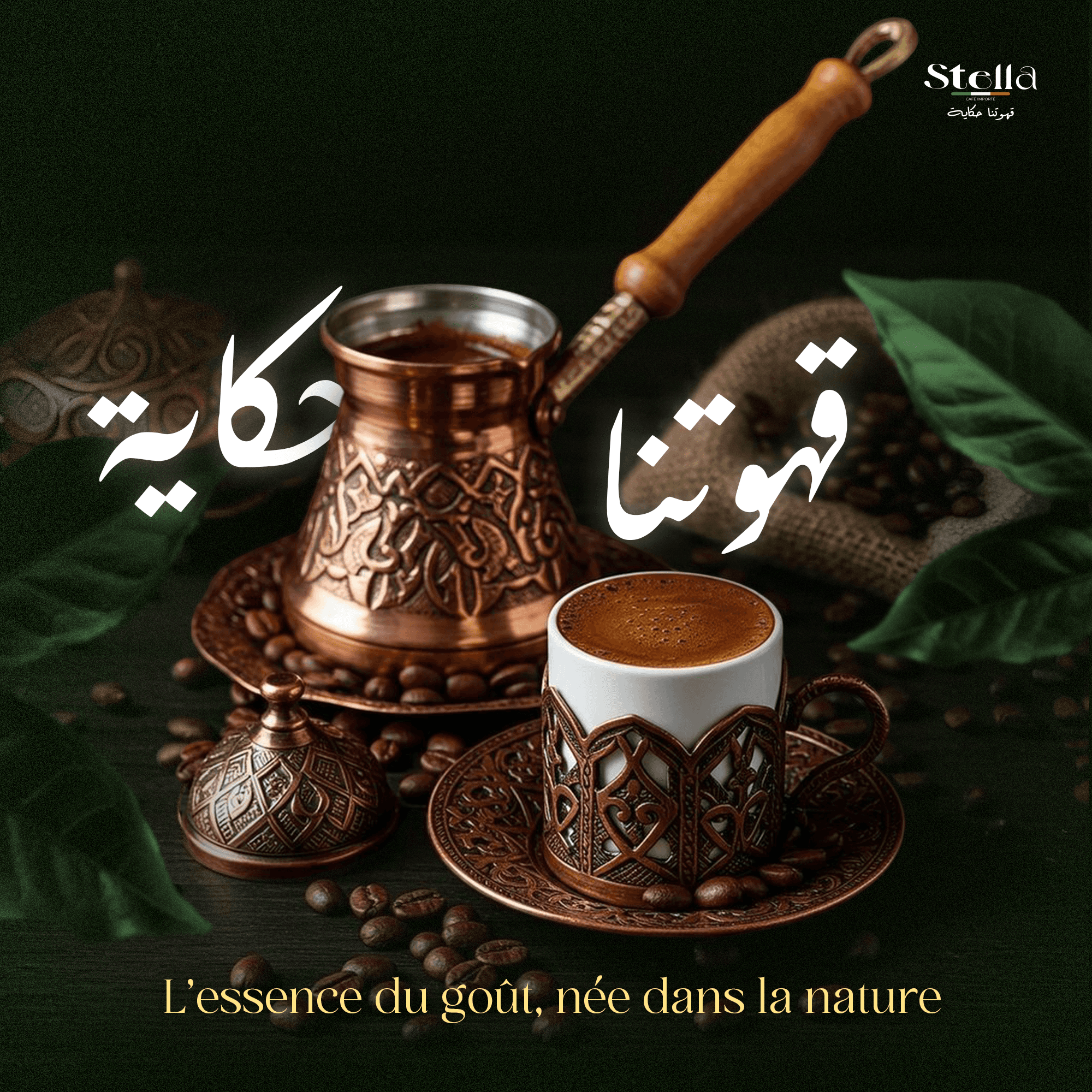
This social media campaign demonstrates a cohesive visual language built through careful art direction. By blending a sophisticated palette
of deep emerald greens and premium gold typography with authentic, tactile coffee imagery, the design elevates the brand's digital presence.
The bilingual approach-seamlessly integrating elegant French serif typography with fluid Arabic calligraphy-bridges cultural narratives,
transforming daily coffee rituals into an engaging online community experience.
For Stella Café, the objective was to craft a visual identity that transcended a standard logo
to create a deeply resonant brand experience.
This social media campaign demonstrates a cohesive visual language built through careful art direction.
By blending a sophisticated palette of deep emerald greens and premium gold typography with authentic,
tactile coffee imagery, the design elevates the brand's digital presence.
The bilingual approach-seamlessly integrating elegant French serif typography with fluid Arabic calligraphy-bridges cultural narratives, transforming daily coffee rituals into an engaging online community experience.


Building a Digital Coffee Culture:
For Stella Café, the objective was to craft a visual identity that transcended a standard logo to create a deeply resonant brand experience.
This social media campaign demonstrates a cohesive visual language built through careful art direction. By blending a sophisticated palette of deep emerald greens and premium gold typography with authentic, tactile coffee imagery, the design elevates the brand's digital presence.
The bilingual approach-seamlessly integrating elegant French serif typography with fluid Arabic calligraphy-bridges cultural narratives, transforming daily coffee rituals into
an engaging online community experience.


Premium Packaging Identity:
Premium Packaging Identity:
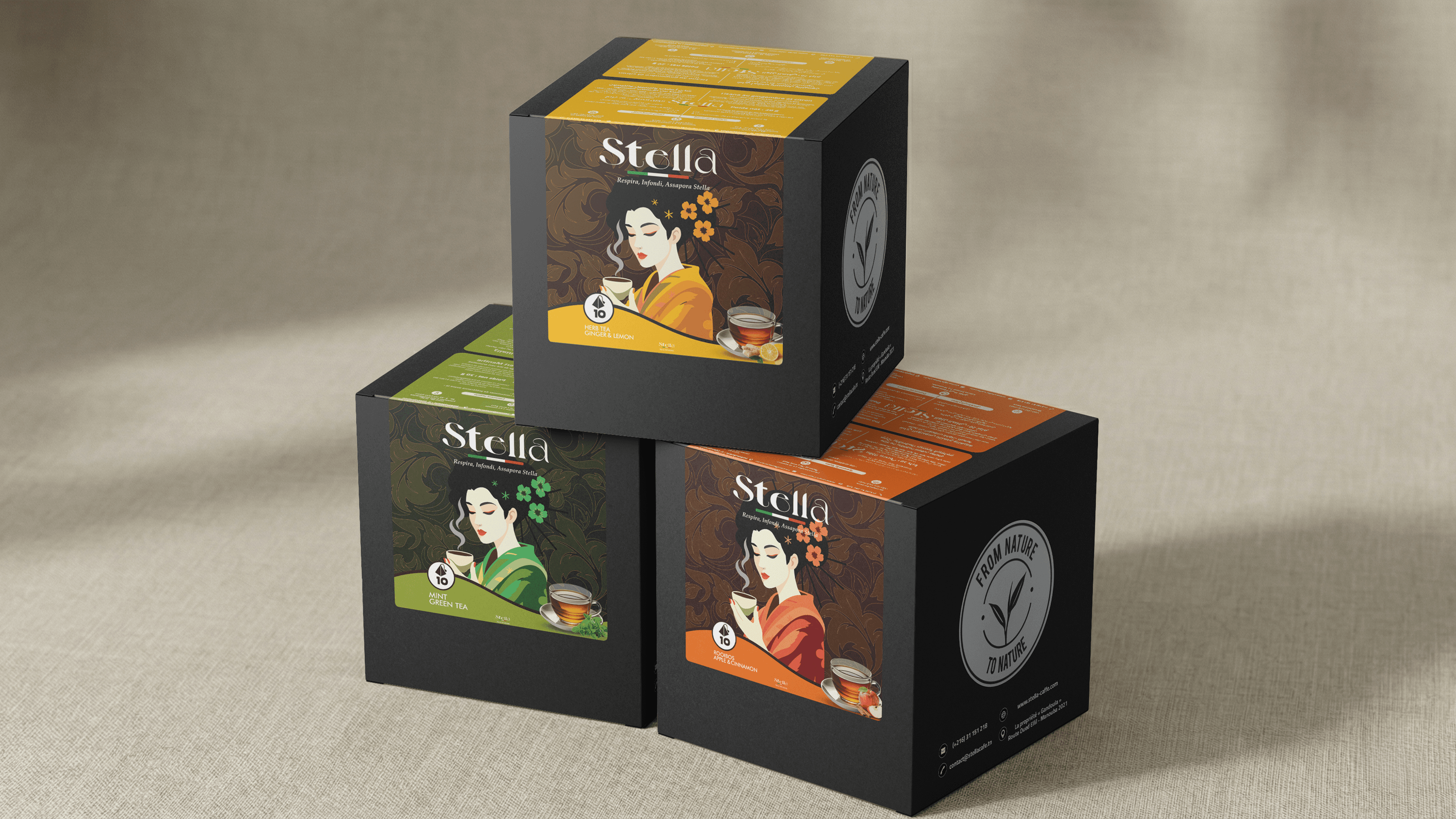
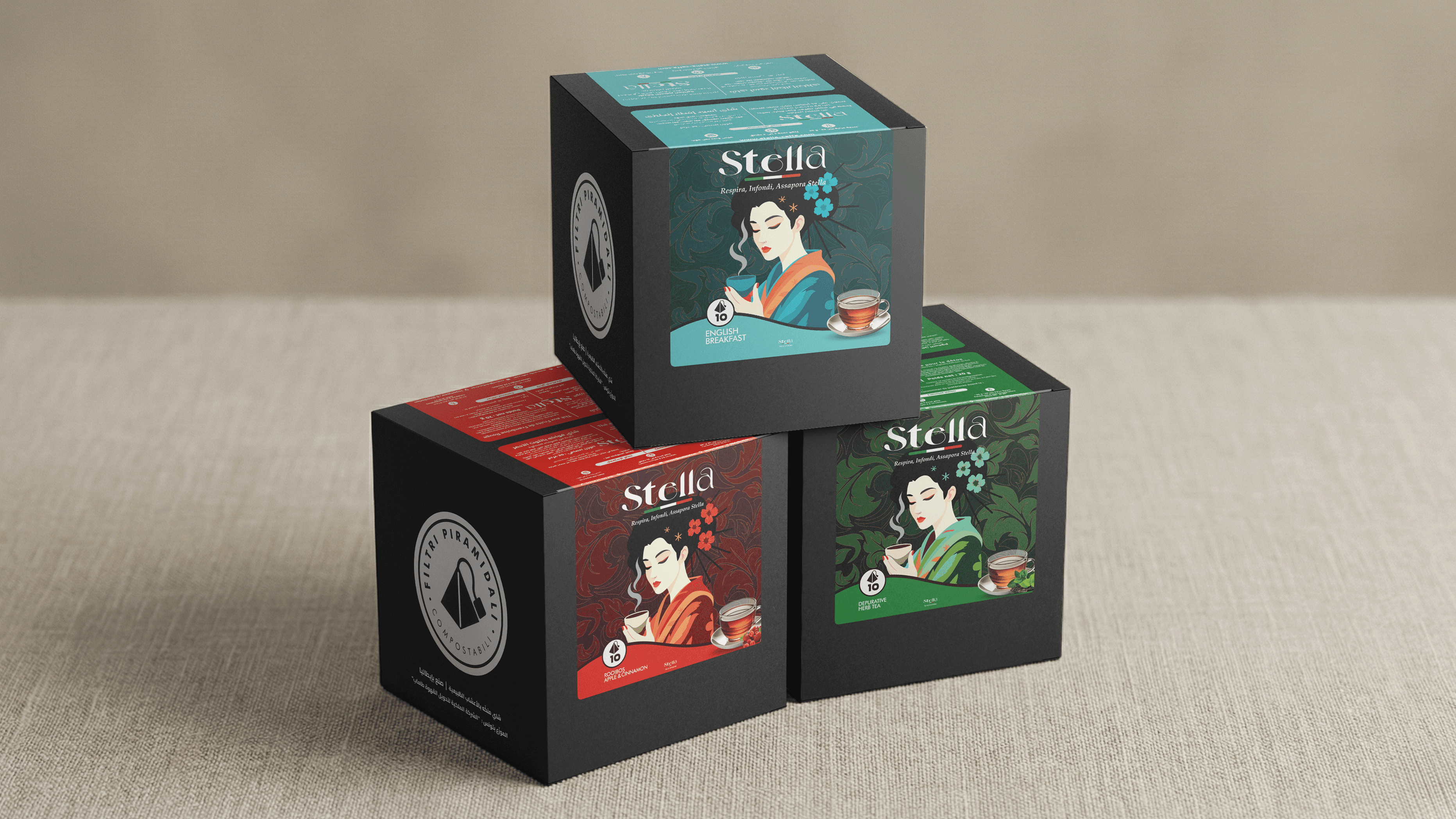
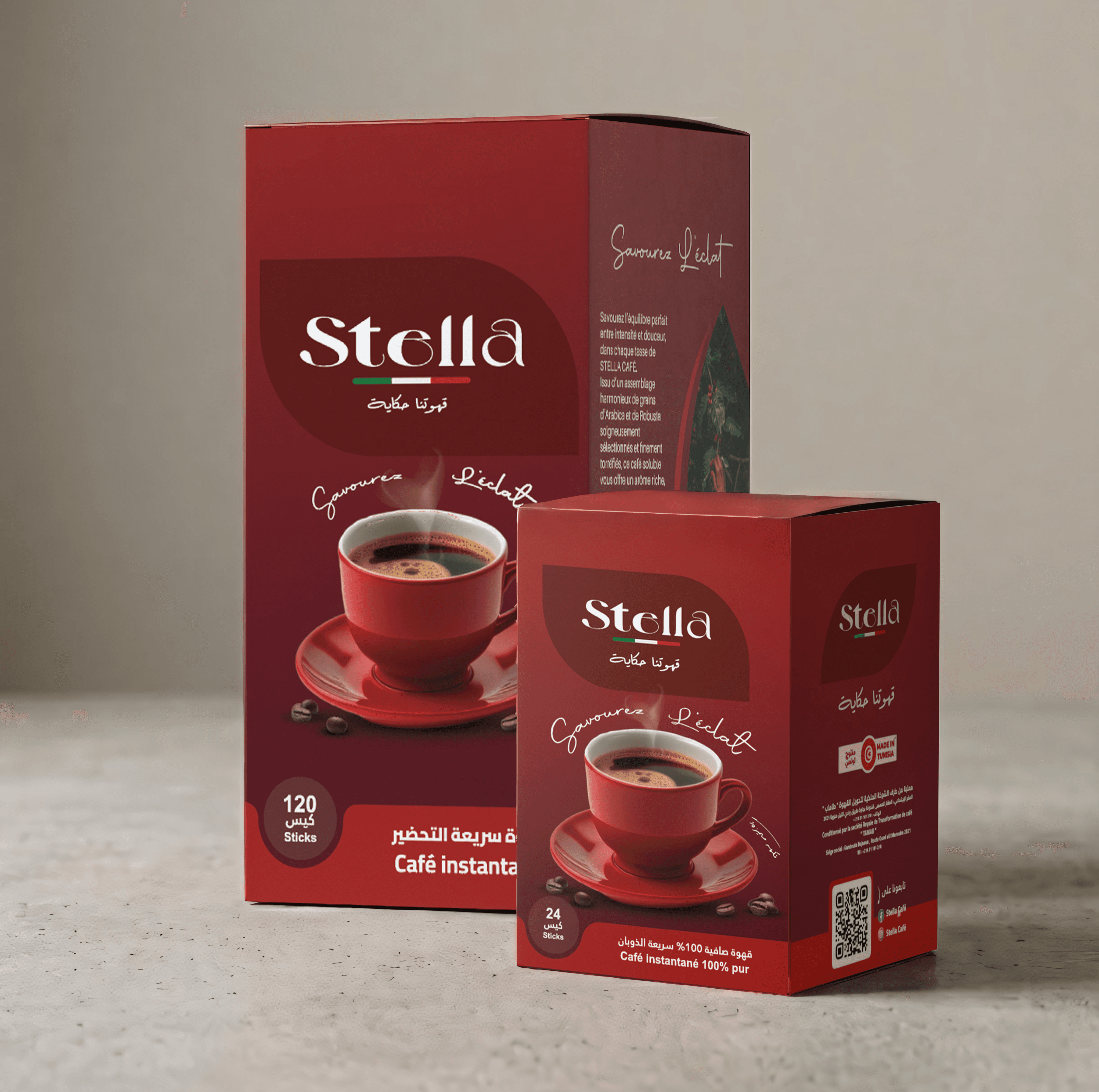
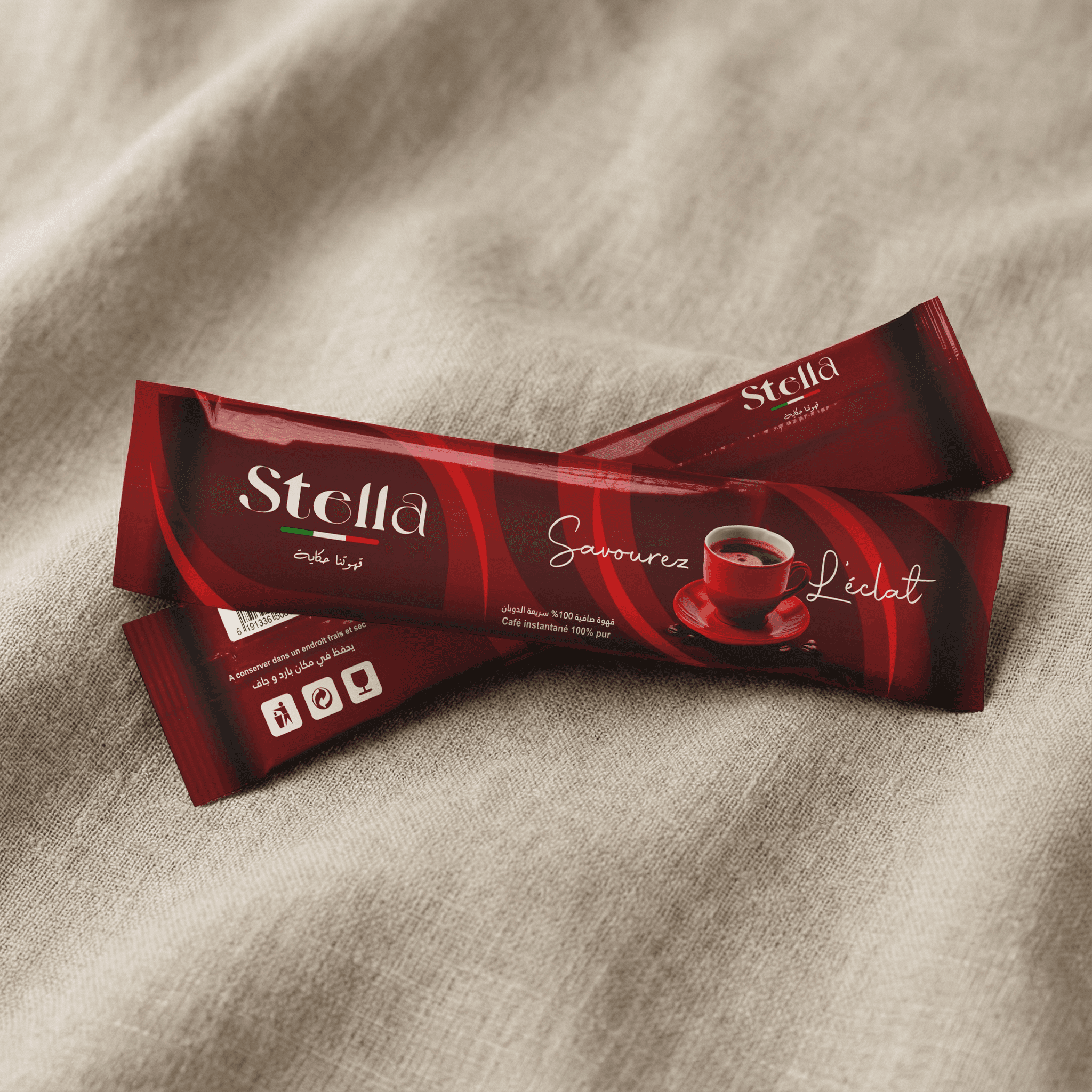
I designed a versatile, premium packaging suite. The boutique tea collection contrasts sleek matte black boxes with vibrant, culturally inspired botanical illustrations for intuitive flavor identification. Meanwhile, the soluble coffee line utilizes rich crimson tones and elegant sweeping curves for modern commercial appeal. Both seamlessly blend bilingual typography with shelf-ready sophistication.
I designed a versatile, premium packaging suite. The boutique tea collection contrasts sleek matte black boxes with vibrant, culturally inspired botanical illustrations for intuitive flavor identification.
Meanwhile, the soluble coffee line utilizes rich crimson tones
and elegant sweeping curves for modern commercial appeal.
Both seamlessly blend bilingual typography with shelf-ready sophistication.
I designed a versatile, premium packaging suite. The boutique tea collection contrasts sleek matte black boxes with vibrant, culturally inspired botanical illustrations for intuitive flavor identification.
Meanwhile, the soluble coffee line utilizes rich crimson tones and elegant sweeping curves for modern commercial appeal. Both seamlessly blend bilingual typography with shelf-ready sophistication.
Experiential Branding
& Event Collateral:
Experiential Branding
& Event Collateral:
Experiential Branding
& Event Collateral:
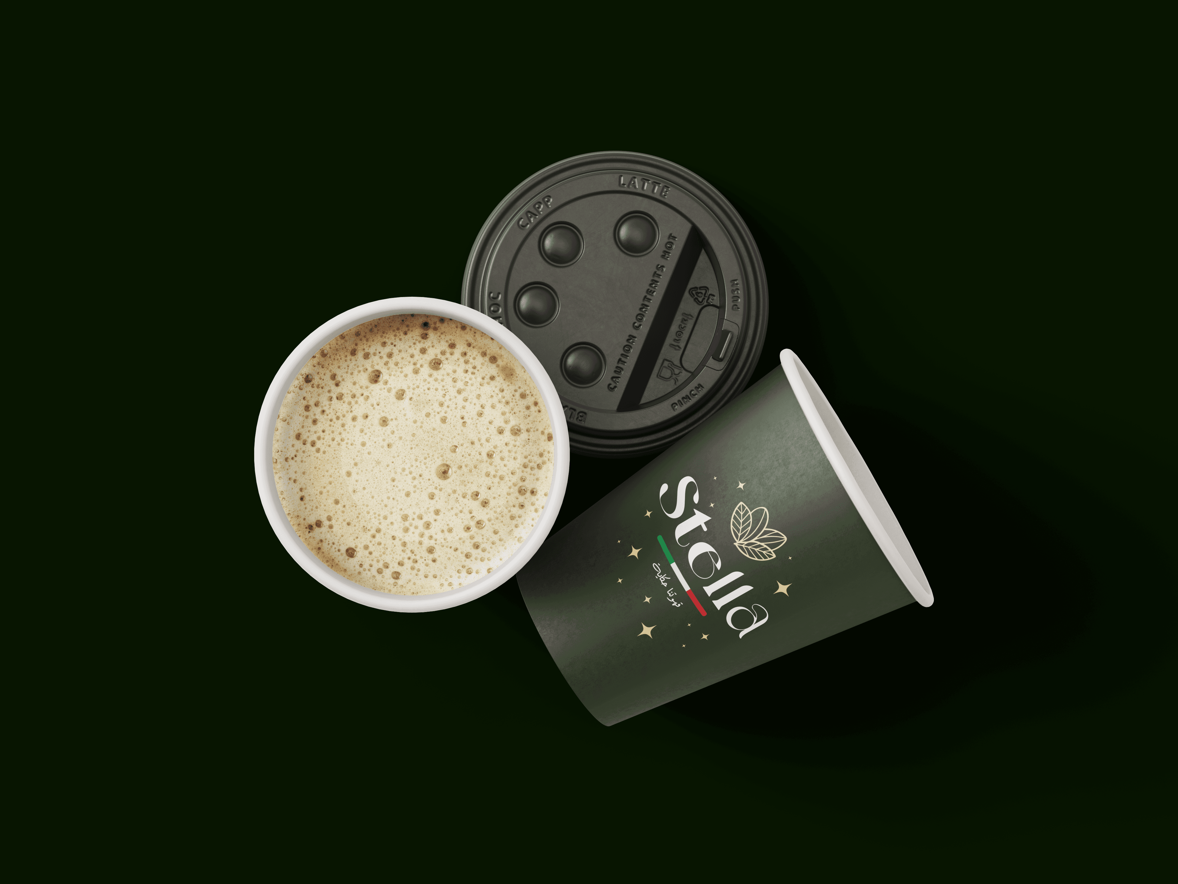
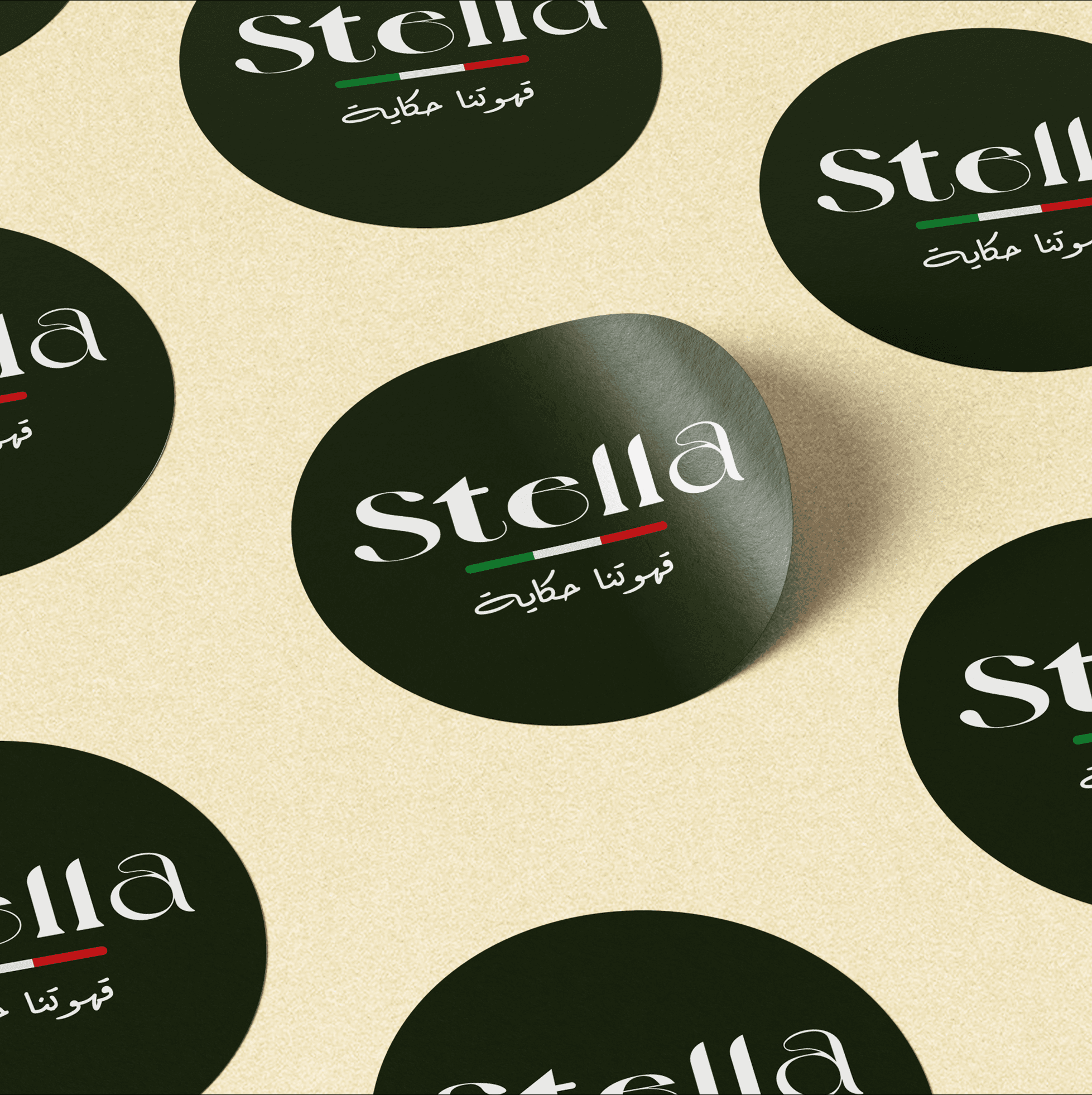
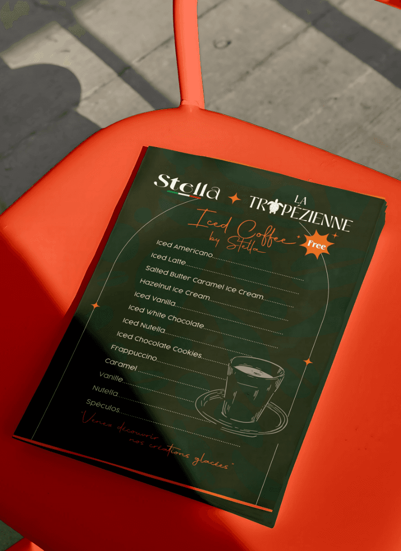
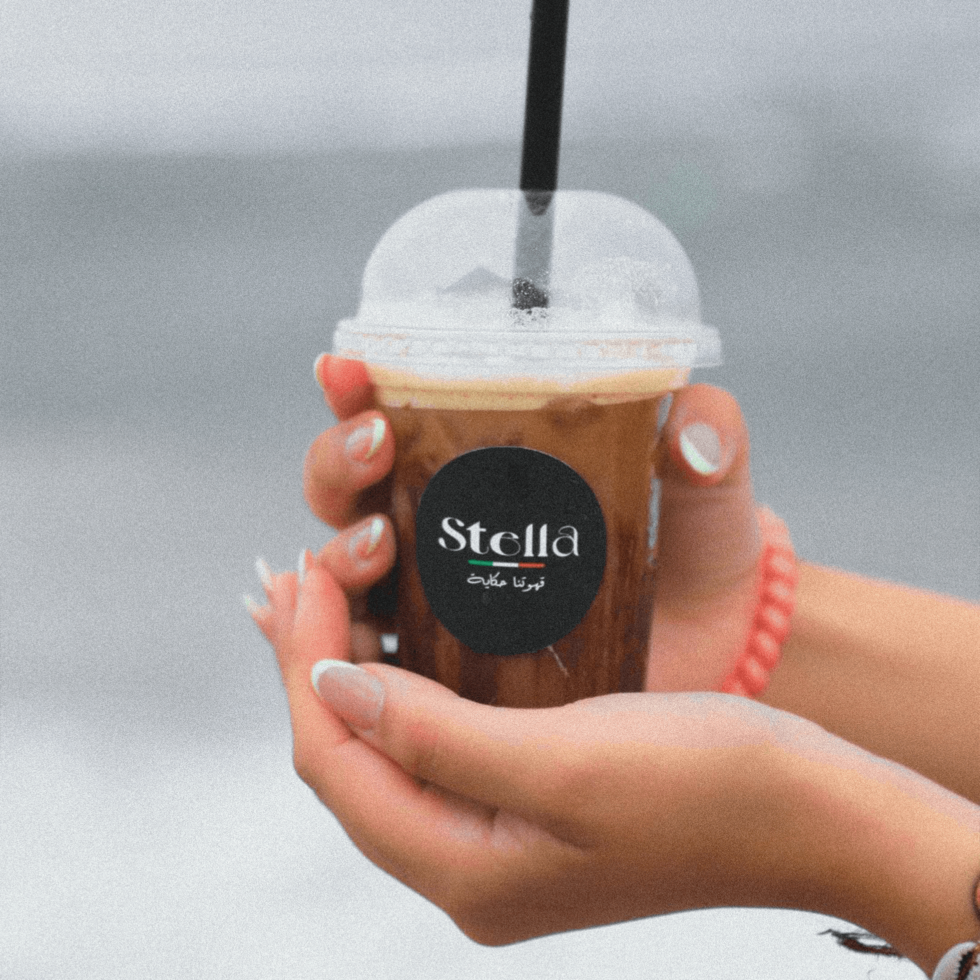
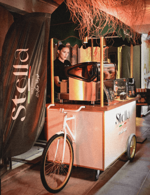
To extend Stella Café's premium identity into physical spaces, I designed a cohesive suite of event materials and merchandise.
This includes versatile, color-coded cup stickers, elegant hot cups, and a co-branded event menu. The clean aesthetic ensures
consistent brand recognition, delivering a luxurious experience whether at a mobile coffee cart or directly in a customer's hand.
To extend Stella Café's premium identity into physical spaces,
I designed a cohesive suite of event materials and merchandise.
This includes versatile, color-coded cup stickers, elegant hot cups,
and a co-branded event menu. The clean aesthetic ensures consistent brand recognition, delivering a luxurious experience whether at a mobile coffee cart or directly in a customer's hand.
To extend Stella Café's premium identity into physical spaces, I designed a cohesive suite of event materials and merchandise.
This includes versatile, color-coded cup stickers, elegant hot cups, and a co-branded event menu.
The clean aesthetic ensures consistent brand recognition, delivering a luxurious experience whether at a mobile coffee cart or directly in a customer's hand.
Chromatic Flavor System
& Capsule Packaging:
Chromatic Flavor System & Capsule Packaging:
For Stella Café's premium aluminum capsule line, I developed a cohesive and vibrant packaging system across eight distinct blends.
The design features a modern, geometric illustration style where each flavor-from Espresso Brasile to Creme Brulee-is intuitively distinguished by a custom, color-coded palette. Blending elegant bilingual typography with bold, abstract visuals, this system ensures strong shelf standout while effortlessly communicating flavor profiles and uncompromising Italian quality.
For Stella Café's premium aluminum capsule line, I developed a cohesive and vibrant packaging system across eight distinct blends.
The design features a modern, geometric illustration style where each flavor-from Espresso Brasile to Creme Brulee-is intuitively distinguished by a custom, color-coded palette.
Blending elegant bilingual typography with bold, abstract visuals, this system ensures strong shelf standout while effortlessly communicating flavor profiles and uncompromising Italian quality.
For Stella Café's premium aluminum capsule line, I developed a cohesive and vibrant packaging
system across eight distinct blends.
The design features a modern, geometric illustration style where each flavor-from Espresso Brasile to Creme Brulee-is intuitively distinguished by a custom, color-coded palette.
Blending elegant bilingual typography with bold, abstract visuals, this system ensures strong shelf standout while effortlessly communicating flavor profiles and uncompromising Italian quality.


