Medical Air Transport: Designing for Crisis

Medical Air Transport: Designing for Crisis

Designing for medical emergencies requires balancing urgency with absolute trust. In this design assessment, I created a high-conversion landing page for medical air transport. The core challenge was human-centered: how to reduce cognitive load for highly stressed users while providing a clear, accessible path to request immediate life-saving help.

Designing for medical emergencies requires balancing urgency with absolute trust. In this design assessment, I created a high-conversion landing page for medical air transport. The core challenge was human-centered: how to reduce cognitive load for highly stressed users while providing a clear, accessible path to request immediate life-saving help.

CLIENT

Vendata

DELIVERABLES

HIGH-FIDELITY MOCKUPS INTERACTIVE PROTOTYPE STYLE GUIDE MOBILE ADAPTATION

Year

2025

Role

UI DESIGN & PROTOTYPING
DD
ii
gg
ii
tt
aa
ll
DD
ii
ss
rr
uu
pp
tt
ii
oo
nn
ss
  
((
MM
ii
xx
ee
dd
  
MM
ee
dd
ii
aa
))

2024:

UU
rr
gg
ee
nn
cc
yy
  
MM
ee
ee
tt
ss
  
CC
aa
ll
mm
::

When every second counts, clarity is a lifesaver.

I designed the hero section with a strict visual hierarchy, placing the

'Get a Free Quote' CTA and the emergency contact line at the immediate forefront. The clean layout and reassuring professional blue color palette were intentionally chosen to reduce user panic and instill a sense

of reliability for families in distress.

When every second counts, clarity is a lifesaver.

I designed the hero section with a strict visual hierarchy, placing the

'Get a Free Quote' CTA and the emergency contact line at the immediate forefront. The clean layout and reassuring professional blue color palette were intentionally chosen to reduce user panic and instill a sense

of reliability for families in distress.

MM
ii
nn
ii
mm
ii
zz
ii
nn
gg
  
CC
oo
gg
nn
ii
tt
ii
vv
ee
  
LL
oo
aa
dd
::

Users booking a medical flight are often under extreme emotional stress. To accommodate this, I streamlined the booking UX to ask only for essential, immediate information (Location, Phone, Patient Condition). By minimizing input fields and using clear form boundaries, the design reduces friction and accelerates the crucial first step of getting help.

FF
ll
ee
ee
tt
  
&&
  
CC
aa
pp
aa
bb
ii
ll
ii
tt
ii
ee
ss
::
  
TT
rr
aa
nn
ss
pp
aa
rr
ee
nn
tt
  
LL
oo
gg
ii
ss
tt
ii
cc
ss

To reassure clients about the service's medical readiness, I created a

dedicated section showcasing the transport options (Helicopters, Airplanes, and Airport logistics). Using distinct, easily scannable cards paired with realistic photography

of medical loading procedures, the design provides immediate visual proof of the

ICU-level capabilities available.


GG
ll
oo
bb
aa
ll
  
RR
ee
aa
cc
hh
  
&&
  
SS
oo
cc
ii
aa
ll
  
PP
rr
oo
oo
ff
::

Medical transport decisions are high-stakes and deeply personal.

I integrated a global operations map alongside verified family testimonials to provide immediate social proof. This dual approach bridges the gap between logistical capability and human empathy, reassuring users that expert help is both globally accessible and personally compassionate.

SS
ee
aa
mm
ll
ee
ss
ss
  
CC
rr
oo
ss
ss
--
DD
ee
vv
ii
cc
ee
  
EE
xx
pp
ee
rr
ii
ee
nn
cc
ee
::
SS
ee
aa
mm
ll
ee
ss
ss
  
CC
rr
oo
ss
ss
--
DD
ee
vv
ii
cc
ee
  
EE
xx
pp
ee
rr
ii
ee
nn
cc
ee
::


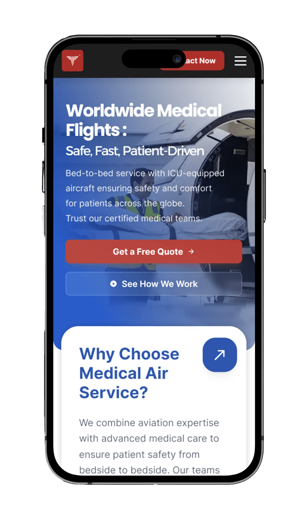
Emergencies don't wait for a desktop connection. I ensured the landing page is fully responsive, maintaining a consistent visual hierarchy from desktop to mobile. Critical actions-like calling support or requesting a callback-remain intuitive and instantly accessible,

adapting perfectly to the user's context without losing the clarity of information.

Seamless

Cross-Device Experience :


Emergencies don't wait for a desktop connection. I ensured the landing page is fully responsive, maintaining a consistent visual hierarchy from desktop to mobile. Critical actions-like calling support or requesting a callback-remain intuitive and instantly accessible, adapting perfectly to the user's context without losing the clarity of information.

Emergencies don't wait for a desktop connection. I ensured the landing page is fully responsive, maintaining a consistent visual hierarchy from desktop to mobile. Critical actions-like calling support or requesting a callback-remain intuitive and instantly accessible,

adapting perfectly to the user's context without losing the clarity of information.

Digital Disruptions
(Mixed Media) 2024:

Create a free website with Framer, the website builder loved by startups, designers and agencies.